Thursday 17 May 2012

The Diamond Jubilee comes to Old Amersham


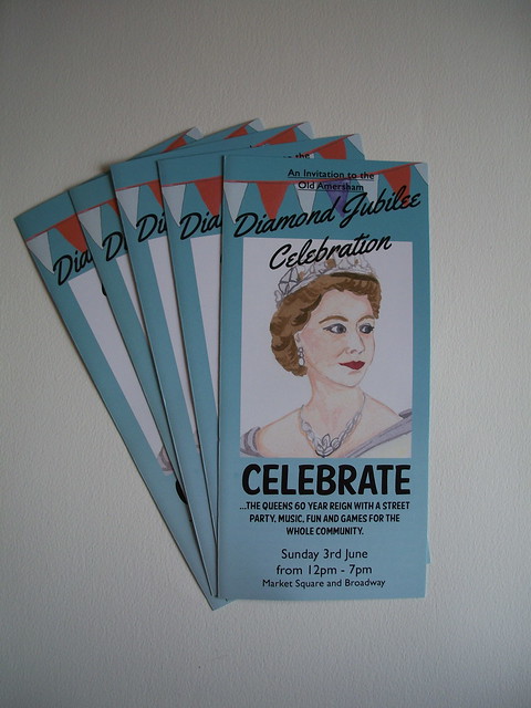
You may remember that last year I designed a lovely 'British' themed flyer for Old Amersham's Royal Wedding street party celebrations.  You can see the designs here and here.  I was so chuffed with the finished design and so was Old Amersham as they've come to me again this year to design the Diamond Jubilee street party flyers!  I'm so touched to be asked again, I really enjoy being able to design for my local town.  


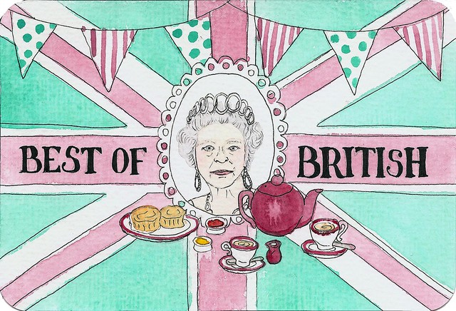
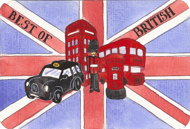
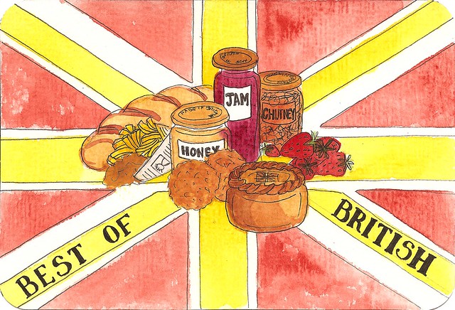
This year, as you can hopefully see, the theme has gone towards '1950's Britain' in keeping with the Queens Coronation 60 years ago.  This was a nice challenge as I've never had such a task!  I enjoyed being able to illustrate from original photos from the day and researching into colours and fonts.


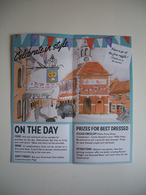
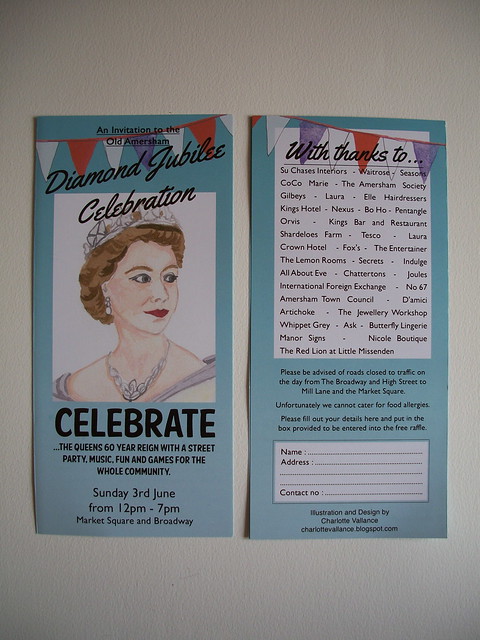
The only specifications for this flyer was the layout - how it's set up as a folded flyer rather than a flat 'A' size, and for it to be in keeping with 1950's design.  I'd love to hear your feedback on this.  I'm rather proud of the background colour myself, I think it was the icing on the cake for these flyers!


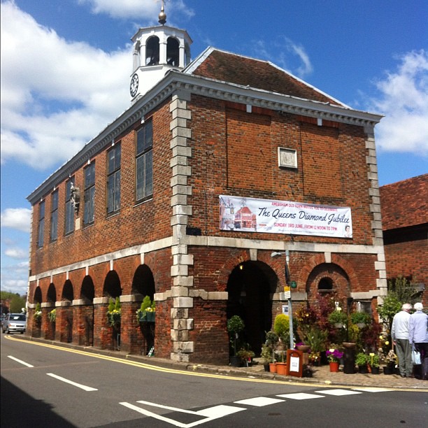
Last weekend I took a lovely walk down to Old Amersham and was greeted by this great banner put together by Manor Signs with my illustrations on it!  It looked so lovely, the sun was shining and there was the plant market in the market square - perfect.


Are you local to Old Amersham?  Come and say hello if you make it on the day!


Monday 7 May 2012

Best of British

Best of Britain


I entered a competition recently to design a postcard that portrayed the 'Best of Britain' which was set up by the Corinium Museum in Cirencester, UK.  The winning design then goes on to become a stamp design and feature on the front cover of a book of the best designs.  All entries will also be featured in a Jubilee Exhibition at the Corinium Museum from the 30th April till the 5th June.

I did a little collection of four designs as I couldn't pick just one! The first one (above) shows our Queen, she really does Britain proud. The background is the Union Jack in her colours along with tea, scones and bunting which are a few things that I associate with being 'typically British'.


This is my second of the four designs and it shows the traditional London attractions. The red telephone box, post box and bus, a black taxi and a guard from Buckingham Palace.


My third of the four designs shows British food! Well a selection, there is more than I realised or could fit on nicely. Bread, scotch eggs, jam, honey, chutney, strawberries, fish & chips and pie.


My final design brings together the United Kingdom through flowers of England, Ireland, Wales and Scotland.


You can see the winning design and all the other entries on the Best of Britain blog page here  And you can find the Corinium Museum website here for more details on the exhibition.  If you're interested in buying a set of these postcards, keep an eye out in my online shop here.

You can also now purchase the book of the entries at amazon here.

Tuesday 1 May 2012

Private, staff only


Typography for the Artichoke restaurant

Recently I was contacted by a restaurant local to me in Old Amersham called 'Artichoke'.  It is a lovely little restaurant across the street from the cafe where I used to work.  They have a great colour scheme going on both inside and out of soft natural colours, an amazing open kitchen, so if you're close enough you would be able to see them preparing your dinner!  Find them online here and follow them on Twitter for quick updates here.

They were wanting me to do some signage for them for within the restaurant.  The dining areas have a lovely feel to them and standard signs just wouldn't fit in!  'Please mind your head' and 'private, staff only' are self explanatory and save customers the embarrassment of having to ask or going the wrong way.

Along with the guideline of using lower case font for the two signs I tried to compliment their colour scheme with my choice of typography design.  I stuck with a simple, yet elegant font, and added in a few twists and flicks to make it their own.

'private, staff only'

Up these little stairs is another kitchen (not the toilets as you may think) so this little sign will save customers a tricky climb up the higgledy steps.

'please mind your head' Cropped view

This sign is quite self explanatory, the beam is pretty low (I just had to stand on tip toes to draw out my design comfortably!) and they were fearful for their customers heads.  This sign is now on both sides of the beam so you're sure to 'please mind your head' from both directions.

'please mind your head' Full view

'please mind your head' Up close view

I loved doing this commission, something new and a bit different from my 'normal' at the moment.

Do you need a sign painting and quite like this style?  Get in touch via email charlotte_vallance(at)hotmail.com or leave your details in a comment on this post and I'll get back to you.


This post needs a special mention to the lovely ladies Laura Manfre and Anika Starmer.  They helped me to continue posting images on my blog posts.  Please check out their lovely work (click on their respective names for the link to their work).

Thank you!