Typography for the Artichoke restaurant
Recently I was contacted by a restaurant local to me in Old Amersham called 'Artichoke'. It is a lovely little restaurant across the street from the cafe where I used to work. They have a great colour scheme going on both inside and out of soft natural colours, an amazing open kitchen, so if you're close enough you would be able to see them preparing your dinner! Find them online here and follow them on Twitter for quick updates here.
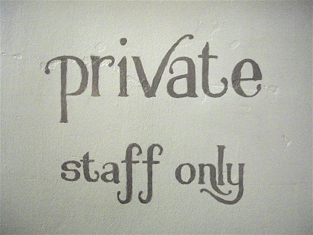
They were wanting me to do some signage for them for within the restaurant. The dining areas have a lovely feel to them and standard signs just wouldn't fit in! 'Please mind your head' and 'private, staff only' are self explanatory and save customers the embarrassment of having to ask or going the wrong way.
Along with the guideline of using lower case font for the two signs I tried to compliment their colour scheme with my choice of typography design. I stuck with a simple, yet elegant font, and added in a few twists and flicks to make it their own.
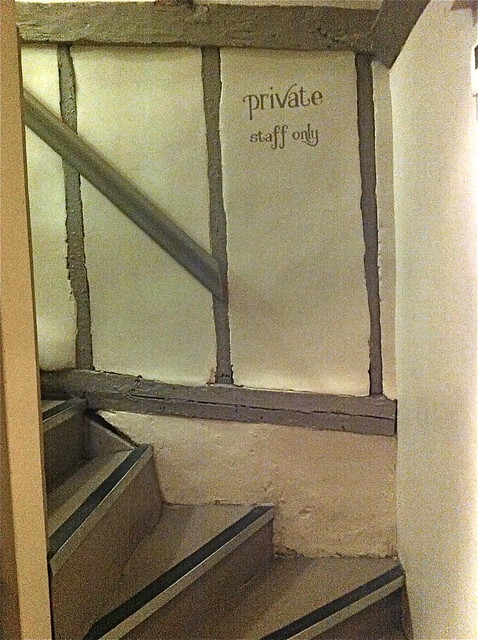
'private, staff only'
Up these little stairs is another kitchen (not the toilets as you may think) so this little sign will save customers a tricky climb up the higgledy steps.
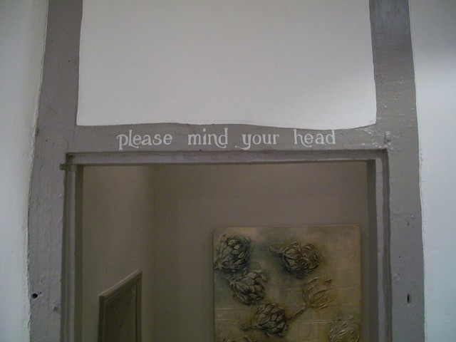
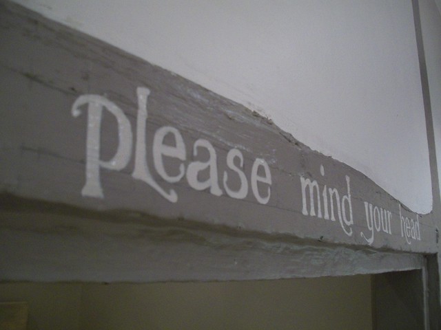
'please mind your head' Cropped view
This sign is quite self explanatory, the beam is pretty low (I just had to stand on tip toes to draw out my design comfortably!) and they were fearful for their customers heads. This sign is now on both sides of the beam so you're sure to 'please mind your head' from both directions.

'please mind your head' Full view
'please mind your head' Up close view
I loved doing this commission, something new and a bit different from my 'normal' at the moment.
Do you need a sign painting and quite like this style? Get in touch via email charlotte_vallance(at)hotmail.com or leave your details in a comment on this post and I'll get back to you.
This post needs a special mention to the lovely ladies Laura Manfre and Anika Starmer. They helped me to continue posting images on my blog posts. Please check out their lovely work (click on their respective names for the link to their work).
Thank you!
2 comments:
very cool! that does seem like it would be a fun project. i really like your lettering. The photos look great! :)
Thank you Anika! Yes, I did really enjoy it!
Post a Comment