Showing posts with label typography. Show all posts

Tuesday, 26 January 2016

Not just for Valentines Day


Valentines Day.

You either love it or you hate it.

But I'm actually somewhere in between.  

So my 'Valentines' card this year celebrates an action rather than just full on love, which reminds me that love isn't just for a significant other.  It's for friends and family too, where ever they may be.


This was the valentine that I gave to my boyfriend last year, and we went on many adventures together, I'm looking forward to another year of that but feeling the pressure to produce a better card than last year...


You can buy this card (A5 and printed on a lovely textured stock) in both my Etsy and Not on the High Street shops, if you fancy exploring with someone you love.  Here are the links to the shops:

www.charlottevallance.etsy.com

www.notonthehighstreet.com/charlottevallanceillustrationanddesign

Monday, 22 June 2015

Hand Painted Bespoke Cards

Mother's Day Cards

I've been painting and illustrating quite a few cards recently - which I love doing!  It adds such a personal touch to something that I love to do - send post!  Sometimes theres just not the right card for the occasion (or for the person) in the shop, so I have to get creative :)

A Card for a Travel Themed Wedding
New Home Card

Birthday wishes for a cocktail loving man.
A lovely friend of mine had BACK SURGERY!  Not many cards for that I can tell you.

Happy Grandpa's day to my Grandpa!  And Happy Fathers' Day to the best Dad!


Have you made any cards recently?  I'd love to see them!  If you'd like to commission me to paint you a bespoke card, just get in touch - prices are very reasonable.

Saturday, 31 May 2014

Floral Alphabet


Being creative in nature means I'm constantly thinking up fun/amazing/beautiful/inspiring new projects to do, either by myself or as little collaborations with fellow creatives.  This particular one was dreamt up between myself and Kate Bufton of Book Transformations.  The idea was to send each other postcards, each time with the next letter of the alphabet on with illustrations on a set theme.


As with most projects we got distracted with real work and got bogged down with the details - it took us a good few months to decide on a theme and even then if didn't get started so we (I) scratched that theme.  I send quite a few letters to my Gran and knowing she likes flowers I got her input and help with finding different flowers/plants for each letter of the alphabet.


These three floral alphabet cards will be going out to Kate, my Gran, and my friend Lou (who wanted to send more post this year).  But then this little project is going to finish here.  I might take up a different approach to the illustrations that makes it less demanding, and probably start again with that idea!  But not for a little while.

Sunday, 23 February 2014

Floral Design


I've dabbled a bit in illustrating flowers, somehow they are a subject that often comes up.  And thank goodness I have!  From the days of working at Seasons in Old Amersham, I worked with Annie Rose and she has since gone off and qualified as a florist!  I've seen the beautiful creations she's been making over her course and training at a florist and have been so proud and pleased for her.


It was my absolute delight to be able to illustrate a logo for her.  I've been working more and more with typography and it was nice to put it to good use.  Alongside the illustrated rose the text works really well.  Annie requested we keep it simple in black and white so she can use it across all mediums without having to worry, which is a brilliant idea!  Colours can often come across as too harsh or muted, so her grayscale colour palette will hopefully stay classy where ever it is.


If you're interested in having me illustrate and design a logo for you, please send an email to me at charlotte_vallance@hotmail.com and we can talk business!

Sunday, 2 February 2014

Do as I say, not as I do.


A quote that has been springing to mind recently.  I had fun experimenting with printing in two colours at one time...expect more of this this year!  These aren't colours I would normally opt for but I'm enjoying them a lot, they have nice soft tones to them.

This lovely screen print has been printed on both a lovely handmade paper that I still had from last Christmas (can you believe it?!) as well as my favourite watercolour paper.  It will be in my Etsy shop soon if you'd like one for yourself.

Tuesday, 1 May 2012

Private, staff only


Typography for the Artichoke restaurant

Recently I was contacted by a restaurant local to me in Old Amersham called 'Artichoke'.  It is a lovely little restaurant across the street from the cafe where I used to work.  They have a great colour scheme going on both inside and out of soft natural colours, an amazing open kitchen, so if you're close enough you would be able to see them preparing your dinner!  Find them online here and follow them on Twitter for quick updates here.

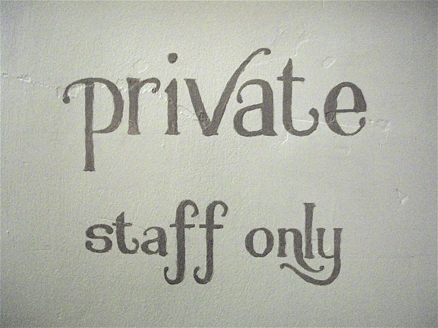
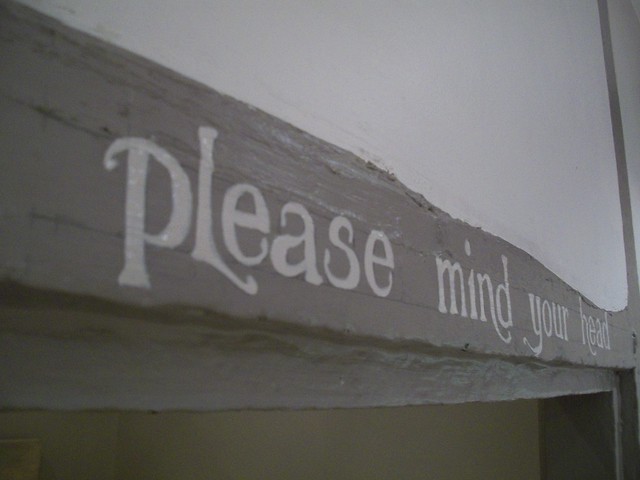
They were wanting me to do some signage for them for within the restaurant.  The dining areas have a lovely feel to them and standard signs just wouldn't fit in!  'Please mind your head' and 'private, staff only' are self explanatory and save customers the embarrassment of having to ask or going the wrong way.

Along with the guideline of using lower case font for the two signs I tried to compliment their colour scheme with my choice of typography design.  I stuck with a simple, yet elegant font, and added in a few twists and flicks to make it their own.

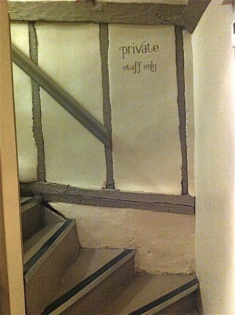
'private, staff only'

Up these little stairs is another kitchen (not the toilets as you may think) so this little sign will save customers a tricky climb up the higgledy steps.

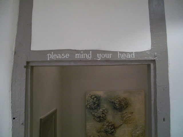
'please mind your head' Cropped view

This sign is quite self explanatory, the beam is pretty low (I just had to stand on tip toes to draw out my design comfortably!) and they were fearful for their customers heads.  This sign is now on both sides of the beam so you're sure to 'please mind your head' from both directions.

'please mind your head' Full view

'please mind your head' Up close view

I loved doing this commission, something new and a bit different from my 'normal' at the moment.

Do you need a sign painting and quite like this style?  Get in touch via email charlotte_vallance(at)hotmail.com or leave your details in a comment on this post and I'll get back to you.


This post needs a special mention to the lovely ladies Laura Manfre and Anika Starmer.  They helped me to continue posting images on my blog posts.  Please check out their lovely work (click on their respective names for the link to their work).

Thank you!